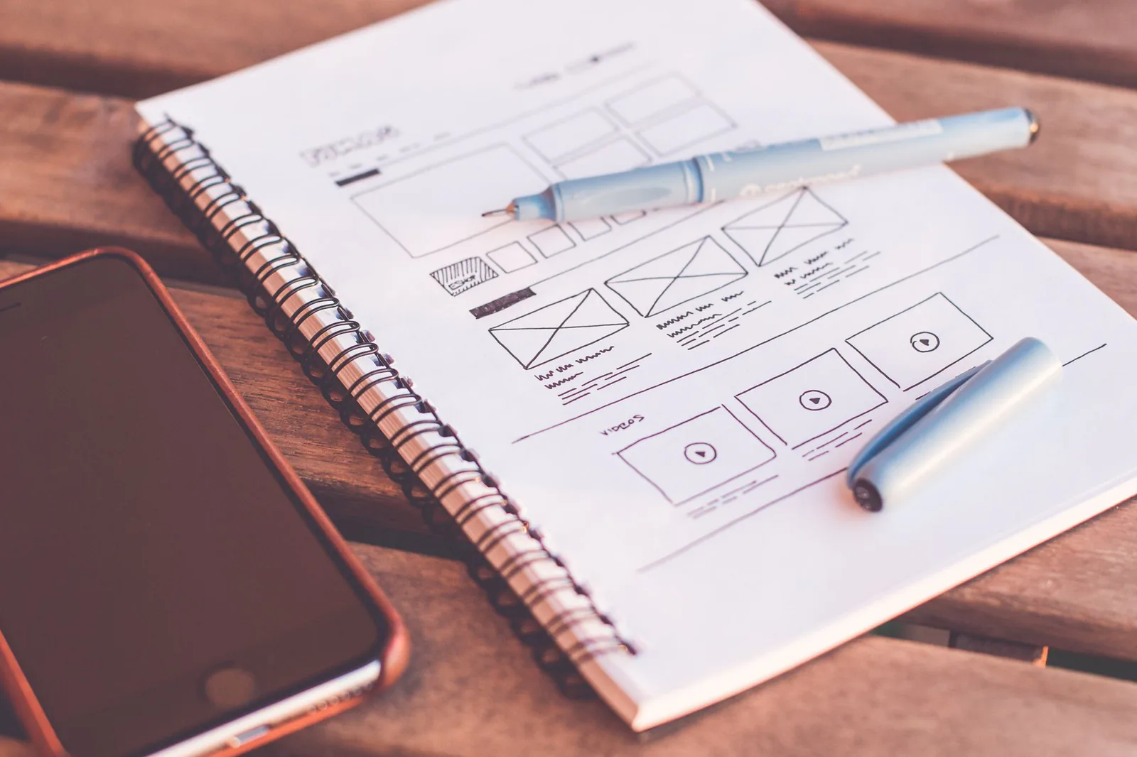
When people hear "prototype," they think of code. A staging environment. A Figma file with hotspots. Something separate from the final product, built to be thrown away. That mental model limits them. A prototype is not a format. It is a stance. It is the decision to build something real enough to learn from and cheap enough to change.
Website builders sit in a strange and powerful place in this picture. They are production tools — you can launch a real site with them. But they are also the fastest prototyping environment most teams have access to. You can go from an idea to a clickable, shareable, testable version in an afternoon. No dev queue. No deployment pipeline. No waiting.
This article is a playbook for using website builders as prototyping tools inside a human-centered design process. It assumes you already understand the basics of HCD — research, ideation, prototyping, testing. What it adds is the specific set of moves that make a website builder behave like a prototyping lab instead of a publishing platform.
Reframe the builder as a research instrument
The first shift is mental. Stop thinking of the website builder as the thing that produces your final site. Start thinking of it as the thing that produces your next round of learning. Every page you build is an experiment. Every section is a hypothesis. Every block you place is a question: "Will the user understand what to do here?"
This reframing changes how you work in three practical ways:
- You build less, faster. If the goal is learning, not launching, you do not need the footer, the legal pages, the perfect color palette. You need the part of the experience that carries your biggest unknown.
- You share earlier. A prototype that sits in the builder is worthless. A prototype that is in front of a user within 24 hours of being built is doing its job. Set a personal rule: no prototype lives more than two days before someone outside the team sees it.
- You detach from aesthetics. A prototype can be ugly and still be useful. If the layout is wrong, no amount of styling will fix it. Test the structure first. Polish later, only on the parts that survived testing.
Build the smallest thing that could prove you are wrong, show it to the people who could prove you wrong, and believe what they do more than what they say.
Choose the right fidelity for the question you are asking
Not every prototype needs to be high-fidelity. The biggest waste of time in a website builder is polishing a prototype that only needed to answer a structural question. Match the fidelity to the question:
Low fidelity — for layout and flow questions
If your question is "Can a user find their way from the homepage to the sign-up form?", you do not need real copy, real images, or real branding. You need boxes, labels, and links. Use placeholder text. Use gray blocks for images. Build the skeleton and test the path. This takes 30 minutes and answers the most fundamental question: does the structure work?
Test this version with five users. Give them a starting point and a goal. Watch their cursor. Do they go where you expected? If they wander, your navigation or visual hierarchy is wrong. Fix the skeleton before you put any meat on it.
Medium fidelity — for content and comprehension questions
If your question is "Does the user understand what this product does and why they should care?", you need real copy and a visual hierarchy that guides attention. But you still do not need final branding, animations, or responsive perfection. Write the actual headlines and body text. Use stock images or rough placeholders. Get the content architecture right.
Test this version with a think-aloud protocol. Ask users to narrate what they are reading and what they expect to happen next. If they misread a headline, the headline is wrong. If they skip a section, the section is not earning its position. Rewrite, restructure, retest.
High fidelity — for trust and conversion questions
If your question is "Will a user actually sign up?", you need the version that looks and feels real. Final colors, final typography, real images, working forms. This is where the website builder earns its keep — you can produce something that looks like a launched product without writing code.
Test this version with task completion metrics. Did they complete the sign-up? How long did it take? Where did they pause? Use the builder's form functionality so the interaction is real, not simulated. The gap between "I would sign up" and actually filling in the form is where most prototypes fail.
Run a website-builder usability test in five steps
Here is a concrete protocol for testing a prototype built in a website builder. It works for any fidelity level. The whole thing takes about 90 minutes: 60 for the sessions, 30 for synthesis.
- Publish a test version. Most builders let you publish to a staging URL or a hidden page. Do that. Do not test in the editor preview — it behaves differently from the live version, and you will miss real rendering issues.
- Recruit five participants. Five is enough to find the major problems. Use your network, your users, or a recruiting service. Screen for people who match your target audience. Anyone who does not match the audience will give you feedback that sends you in the wrong direction.
- Give them a task, not a tour. Do not explain the site. Do not walk them through it. Give them a scenario: "You heard about a tool that helps with X. You ended up on this page. Show me what you would do." Then be quiet. The silence will feel uncomfortable. That discomfort is the point — it is the space where real behavior happens.
- Record what they do, not what they say. Take notes on actions: where they click, where they hesitate, where they scroll past, where they go back. Their verbal commentary is secondary. People will tell you a section is clear and then fail to find the button in it. Believe the button, not the commentary.
- Synthesize immediately. Right after the sessions, while it is fresh, write down the top three problems you saw across multiple participants. Those are your next iteration. One problem seen once is an anecdote. One problem seen three times is a pattern. Fix patterns.
Research from Nielsen Norman Group showed that five users find about 85% of usability problems. Adding more users finds diminishing returns. The move is not to test with more people — it is to test, fix, and test again with five new people. Three rounds of five beats one round of twenty-five.
Iterate in the builder without losing your mind
The beauty of a website builder is that iteration is cheap. The danger is that iteration becomes chaos. If every test leads to a full rebuild, you are not iterating — you are thrashing. Here is how to keep the loop disciplined:
- Change one thing per round. If you rework the navigation, the hero copy, and the form layout all at once, and the next test goes better, you will not know which change helped. Change one variable. Test. Measure. Then change the next one.
- Keep a version log. Before each round of changes, note what you changed and why. After the test, note what happened. This log becomes your design rationale — the story of why the site looks the way it does, backed by evidence instead of opinion.
- Duplicate before you destruct. Most builders let you duplicate a page. Do that before major changes. If the new version tests worse, you have the old one to go back to. This sounds obvious. It is the most commonly skipped step in fast iteration.
- Know when to stop. Prototyping has diminishing returns. When two consecutive rounds of testing reveal no new major problems, you are done. Ship it. The remaining issues will surface in real traffic, and you can fix them with real data instead of more simulated tests.
Common traps when prototyping with website builders
Every tool has failure modes. Here are the ones that catch teams most often when they use website builders for HCD prototyping:
The template trap
Most builders offer templates. Templates are starting points, not decisions. When you use a template unchanged, you are inheriting someone else's design decisions — made for an unknown audience, an unknown product, an unknown context. That is the opposite of human-centered design. Use templates as scaffolding. Replace every piece of content and every structural choice with one you made deliberately.
The feature creep trap
Website builders make it trivially easy to add sections. Testimonials, FAQ accordions, feature grids, video embeds, counters, carousels. Each one feels like it adds value. But every section you add dilutes the attention available for the sections that matter. Before adding a section, ask: "What question does this answer for the user?" If the answer is "none," delete it.
The styling trap
It is easy to spend two hours adjusting the hover state on a button that has never been tested. Styling untested structures is like painting a house with no foundation. Get the structure right, test it, then style what survived. The visual polish should be the last layer, not the first.
The "it works on my screen" trap
Website builder previews lie. They show you the desktop version in a controlled environment. Your users will arrive on phones, tablets, old laptops, and slow connections. Test the published version on multiple devices and multiple browsers. If you only test on your own laptop in Chrome, you are testing for yourself, not for your users.
From prototype to production: the transition
At some point, the prototype stops being a prototype and becomes the site. This transition is not a moment — it is a decision, and it should be a deliberate one. Here are the signs that your prototype is ready to become production:
- You have run at least three rounds of user testing with different participants each time.
- The major usability problems have been identified and fixed. New rounds are finding only minor issues.
- The content is final, not placeholder. Every headline and body block has been written for the real audience.
- The site has been tested on mobile, tablet, and desktop, in at least two browsers.
- Accessibility basics are in place: alt text, color contrast, keyboard navigation, readable font sizes.
If any of these are not true, you are still prototyping. That is fine — keep going. But do not call it launched until the list is complete. A prototype that pretends to be a product sets you up for the worst kind of feedback: the kind that comes from real users who expected something finished.
A prototype is a question wearing the clothes of an answer. The website builder gives you the wardrobe. Human-centered design gives you the question. Ask well, dress appropriately, and listen to what people do — not what they say.