Website builders have changed who can make a website. Five years ago, you needed a developer or a template that screamed "template." Today, anyone with a browser can drag blocks onto a canvas and have something live by lunch. That is a genuine democratization, and it should be celebrated.
But speed is not the same as good design. And shipping a page is not the same as serving the person who will use it. The same tool that lets you build a site in an afternoon also lets you build a site nobody can navigate in an afternoon. The difference is not the tool. It is whether you started with people or with pixels.
This article is a practical guide to keeping human-centered design at the center of your work when you are building with a website builder. No theory you cannot use on Monday morning.
Start with a person, not a homepage
The most common mistake teams make with website builders is opening the editor first. The canvas is empty. The blocks are waiting. It feels productive to start dragging things into place. But you are building for someone you have not met yet.
Before you touch the editor, write down three things about the person you are building for:
- What are they trying to accomplish? Not "buy a product" — but "convince their boss this vendor is worth the budget." The real goal is usually emotional or social, not just transactional.
- What are they worried about? Fear drives more behavior than aspiration. What could go wrong in their mind? What would make them abandon the page?
- Where are they? On a phone, in a meeting, between tasks, on slow Wi-Fi. Context shapes attention more than screen size does.
If you cannot answer these three questions, you are not ready to design. Do a round of interviews first. Five conversations with real people in your target audience will change what you build more than any template ever could.
If you would not be comfortable showing your homepage to one of the people you interviewed, you have not designed for them. You have designed for yourself.
Map the journey before you build the pages
A website is not a collection of pages. It is a path that a person walks from "I have a problem" to "I found a solution." Website builders make it easy to create pages in isolation — a homepage here, a pricing page there, a contact form somewhere else. But if you build pages without mapping how someone moves between them, you get a site that feels like a museum: rooms with no hallway.
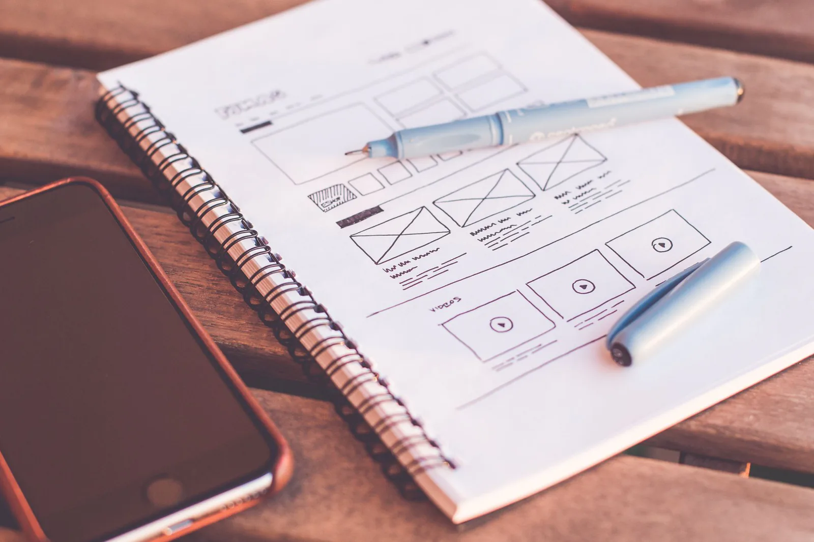
Before building, sketch the journey on paper. Literally on paper — not in the tool.
- Write the entry point at the top: where does this person arrive from? A Google search? A colleague's recommendation? An ad?
- Draw the first thing they need to understand. Usually it is "what is this and is it for me?" That is your homepage's primary job.
- Draw the next decision they need to make. What would they want to see next? That determines your navigation, not the other way around.
- Draw the action you want them to take. Sign up, contact, buy. Everything on the path should serve that action.
Once you have the journey mapped, you know exactly what pages you need, what each page must communicate, and what order they connect in. Now you can open the website builder with a plan instead of a blank stare.
Use the builder as a prototype, not a destination
Here is something most people do not realize: a website builder is one of the fastest prototyping tools you own. You can build a clickable, realistic version of your idea in hours, share a link, and watch someone use it. That is a usability test. That is human-centered design happening in real time.
The mistake is treating the first version as the final version. It is not. It is a hypothesis. Build it, share it with five people who match your target audience, and watch what they do:
- Where do they hesitate? That section is confusing or missing information.
- Where do they scroll past? That section is not earning its space.
- Where do they try to click something that is not clickable? That is a missing link or a visual affordance problem.
- What do they ask you afterward? If they ask "so what does this do?" your homepage failed. Fix it before adding anything new.
Every round of feedback should change the site. If you show it to five people and change nothing, you were not listening. Or you showed it to the wrong people.
Friends and colleagues will tell you it looks nice. They are not your users. Find people who actually have the problem your site solves. Offer them a coffee, a gift card, or just ask. Five real users beat fifty friendly opinions.
Respect the constraints of the medium
Website builders come with constraints. Some are technical — limited control over layout, restricted custom code, template-driven structures. Some are cognitive — the drag-and-drop interface encourages you to add blocks instead of designing relationships between content.
Human-centered design means designing for the real conditions people experience your work in, not the idealized version. That includes the constraints of your tools. Here is how to work with them instead of against them:
- Do not fight the grid. Most builders use a column-based layout system. Design within it rather than trying to hack around it. A clean grid that respects hierarchy will always look more intentional than a "custom" layout that breaks at different screen sizes.
- Mobile is the default, not the fallback. More than half of your visitors will arrive on a phone. Design the mobile version first, then expand. Most builders let you toggle between views — use that toggle constantly, not as a final check.
- Write content before you style it. The biggest waste of time in a website builder is styling a section, then rewriting the copy and having to restyle. Write the words first. Then let the words tell you what the layout should be.
Accessibility is a human-centered design requirement
If you are designing for people, you are designing for all people. That includes people with visual impairments, motor limitations, cognitive differences, and situational constraints like bright sunlight or one-handed use. Accessibility is not a compliance checkbox. It is the most literal expression of human-centered design.
Most website builders give you the tools. The question is whether you use them:
- Alt text on every image. If the image communicates something, describe it. If it is decorative, mark it as such or remove it.
- Color contrast that meets WCAG AA. Light gray text on white is not minimalism. It is exclusion. Test your contrast with a free tool before shipping.
- Keyboard navigation. Can you reach every interactive element with Tab and Enter? If not, someone who cannot use a mouse cannot use your site.
- Readable font sizes. Body text below 16px is a choice to make your site harder to read. Do not make that choice.
Launch is a research event, not a finish line
The temptation with website builders is to treat launch as the end. You built it, you published it, you are done. But a live site is the best research instrument you have. Real traffic, real behavior, real friction — all available to you the moment you publish.
In the first two weeks after launch, pay attention to three things:
- Where do people drop off? Your analytics will show you the last page before someone leaves. That page has a problem. Go look at it with fresh eyes.
- What do people search for? If your builder has a site search feature, read the queries. They tell you what people expected to find and could not. That is your content roadmap.
- What do people email you about? Every support email is a design signal. "I could not find the pricing" is not a user error. It is a navigation failure.
Then iterate. Change one thing at a time, watch what happens, and keep what works. This is the loop that separates a website from a human-centered website.
The tool does not make the designer. The designer makes the tool worth using. A website builder gives you speed. Human-centered design gives you direction. You need both.
The checklist before you publish
Before you hit publish on any site built with a website builder, run through this list. It takes ten minutes and it will catch problems that would otherwise cost you weeks of confused traffic:
- You can name the single person this site is for, and you have talked to someone matching that description.
- Every page has one primary action. If a page has two equally prominent calls to action, pick one.
- The mobile view has been checked on an actual phone, not just the builder's preview toggle.
- Every image has alt text. Every link has a descriptive label (not "click here").
- You have shown the site to at least three people who are not on your team, and you changed something based on what they said.
- The copy is written for the reader, not for the organization. No "we are passionate about delivering synergies." Only "here is what this does for you."
If you can check all six, publish with confidence. If you cannot, spend a morning fixing the gaps. The morning is worth it.